top of page
Mendix App Factory Suite Remake
The current App Factory Suite, a template app that provides best practices, guidelines, and helpful tools to establish, grow and scale the customer’s app factory, has many flaws in its user experience and user interface.
The application includes portfolio, documentation, compass, and activities modules.
Project Overview
Target Users
-
Program owners,
-
System administrators,
-
Solution architects,
-
Developers,
-
Reference users
Some user problems include:
-
No consistency across the platform, which leads to frustration **
-
Confusing information architecture
-
Poorly designed and unfriendly user interface
-
Little to no feedback after a user action
Softwares Used

1
Create user flows after understanding who the app is being used by and why.
2
Research a concept behind design inspiration.
3
Low fidelity wireframes and prototyping to mid and high fidelity wireframes.
4
Style using Mendix Studio Pro and SCSS.
Step 1. User Flow Chart
These are two example user flow charts for solution architects and developers.
What each shape and color code represent:


Step 2. Researching UI Design Inspiration
What is Bauhaus?
Main Motto/Idea behind Bauhaus:
-
Form follows function
-
Focus on functionalism: “design of an object should be determined solely by its function, rather than by aesthetic considerations, and that anything practically designed will be inherently beautiful.”
-
Uses elegant/ minimalistic geometric shapes
-
“Functionality does not need to be boring”
-
No distinction between artist and craftsman
-
-
Constant development
-
Color palette → primary colors
-
Collage design → a bit of surrealism/isolation
-
Balanced asymmetry → “broken grids”
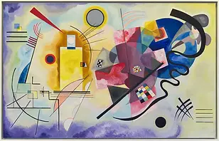
Wassily Kandinsky's Yellow-Read-Blue

Why Bauhaus?
Concept:
-
After seeing Mendix’s style, which seems to be bold with both color and design, I started my inspiration research into detailed line illustrations. As I continued to search for inspiration, I came across a design with orderly shapes/lines that were placed with intention and purpose–inspired by the Bauhaus design.
-
Trendy (modern color palette) with Bauhaus-inspired design. Follows the idea of functionality using direct interactive feedback and emphasizing the use of a function in a beautiful way.
-
This ties back to the idea of making the app “customer friendly” and easy to access.
Step 3. Lo-Fi Wireframes
.png)

.png)
.png)


.png)


.png)

Lo-Fi Wireframe Prototype
Because the application had six different functions, I decided to make a prototype of the configuration function that will be applied to all the other sections.
For the prototype, I maintained consistency across all pages in terms of information architecture, actions, and feedback.
This helped reduce the pain points of trying to figure out how to use the application on every page.
Final Hi-Fi Wireframes
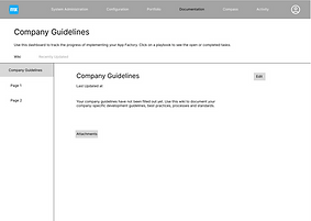
Before
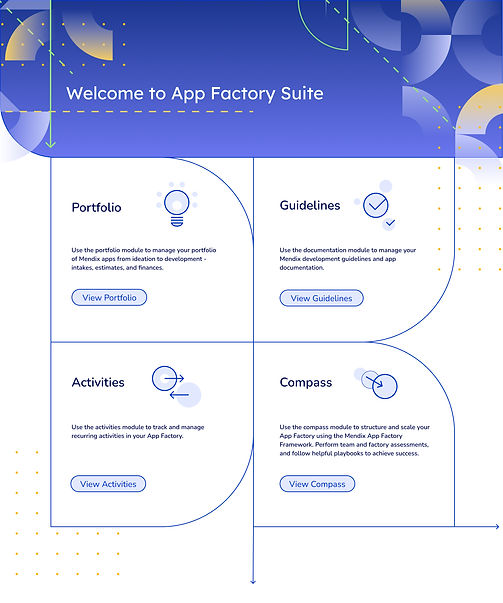
After

.jpg)

.jpg)


bottom of page